
 I’ve heard California is parched. Though, I wouldn’t know. I’m in Maryland now and we’re staring at Hurricane Joaquin who was threatening to wash the east coast into the Atlantic ocean. But as I’ve been trapped here in my cozy cubicle, I think I’ve stumbled across the root of California’s drought crisis.
Let’s begin by looking at some precipitation data from the California Data Exchange Center. Here’s the dataset cleaned and prepped (sadly this is an xlsx file. I just discovered WordPress doesn’t allow csv files or R scripts, boo).
This is precipitation data from the San Joaquin 5-index. Sounds like a nifty El Nino Southern Oscillation or Northern Pacific Gyre Oscillation Index, but alas, this is simply the average monthly rainfall at five stations which are tributaries of the San Joaquin River. Think east of Merced. Oh wait, sorry that’s entirely unhelpful. Some of the stations are at Yosemite Headquarters and Hetch Hetchy, you know…the primary freshwater source for San Francisco (go Giants!).
library (ggplot2); library (tidyr)
data.sj<- read.csv ("CDEC Monthly Precipitation San Joaquin 1913-2014.csv")
str(data.sj)
Let me explain the data….
Region = San Joaquin, duh
WY = water year (Oct 1 – Sept 30), refers to the year that the data ends in. Spans from 1913 to 2014. Wow!
Oct…=months for which there is average precipitation data, there are 12 in a year!
Total = the annual total of precipitation for the index
But, oye, that dataframe is in wide format. Who does that? The CA government I guess? We need it to be in long format.

data.sj_long <- gather(data.sj, month, precipitation, Oct:Total)
#convert from wide to long format, hey tidyr, you would have been great in grad school!

Better.
All the variables are the same as before except we’ve now got a precipitation column which is the index for the month and year at left. It is in inches. Such is the travesty of being a scientist, working in metric. Let’s convert it.
data.sj_total<-subset(data.sj_long, month=="Total") #create  a new total precipitation dataframe
 data.sj_long<-subset(data.sj_long, month!="Total") #remove the total column from the original dataset, it is now 1224 rows long
 data.sj_long$month<-factor(data.sj_long$month) #remove Total from months, this is just an aRtifact, just do it, trust me
 data.sj_long$precipitation.cm<-data.sj_long$precipitation*2.54 #convert inches to cm
 str(data.sj_long) #so now we have a region, WY = water year, month = abbreviation, precip in in, precip in cm
It’s pretty typical to use cumulative precipitation plots to visualize the rainfall patterns over time. So let’s do that.
data.sj_long$cumsum.cm<-ave(data.sj_long$precipitation.cm,
data.sj_long$WY,FUN=cumsum)
This uses the ‘ave’ function. It calculates group averages over factors. We don’t actually want averages, so we’ll use the function “cumsum” which stands for cumulative sum. We want it done for each water year, hence the second part of the function.
Let’s take a quick gander at all of our hard work.
ggplot(data.sj_long,aes(x=month,y=cumsum.cm, group=WY))+geom_line()
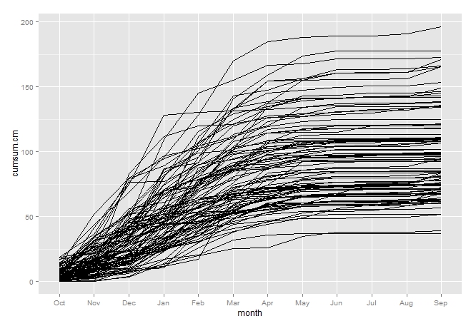
So at the beginning of the water year (Oct) we have a little bit of precipitation but not much. The precipitation curves pretty much all rise in earnest around Dec and through about April and then they stop for the summer. A classic Mediterranean climate baby. That’s why our grapes make such good wine. Love it.
But this is kinda hard to look at. So let’s pick a specific year and compare it to the average. First, lets calculate the average.
mean.sj.cm<-tapply(data.sj_long$cumsum.cm,data.sj_long$month,mean) #calculate mean cumsum precipitation for each month
 mean.sj<-data.frame(month=rownames(mean.sj.cm),mean.sj.cm, WY, highlight) #create dataframe from previous tapply, rownames and means)
 str(data.sj_long)
I created a new dataframe for plotting a new geom on top of the original dataset. There are other ways of combining this with the existing dataset, but this is a pretty easy method that works well.
Now lets create a column called “highlight”. If it’s the year 2014, give it a “yes”, if not, “no”.
data.sj_long$highlight<-ifelse(data.sj_long$WY == 2014,c("yes"),c("no")) #recode data to highlight year 2014
data.sj_long$highlight<-factor(data.sj_long$highlight) #aRtifact, just do it
Now let’s plot it!
sj.plot<-ggplot(data.sj_long,aes(x=month,y=cumsum.cm, color=highlight, group=interaction(WY,highlight)))+
 geom_line(size=1.1)+ geom_line(data=mean.sj,aes(x=month,y=mean.sj.cm),color="black", size=1.1)+
 theme_bw()+scale_color_manual(values=c("grey60","red"))+
 labs(x="Month", y="Monthly cumulative precipitation (cm)")+
 theme(axis.text = element_text(size=15),legend.position="none",
 axis.title.x = element_text(color="#000000", size = 18, vjust=-.2),
 axis.title.y = element_text(color="#000000", size = 18, vjust=1),
 panel.grid.major=element_blank(),panel.grid.minor=element_blank())+
 annotate(geom="text", x=2.5, y=180, label="San Joaquin 5-index",size=6 )
 sj.plot
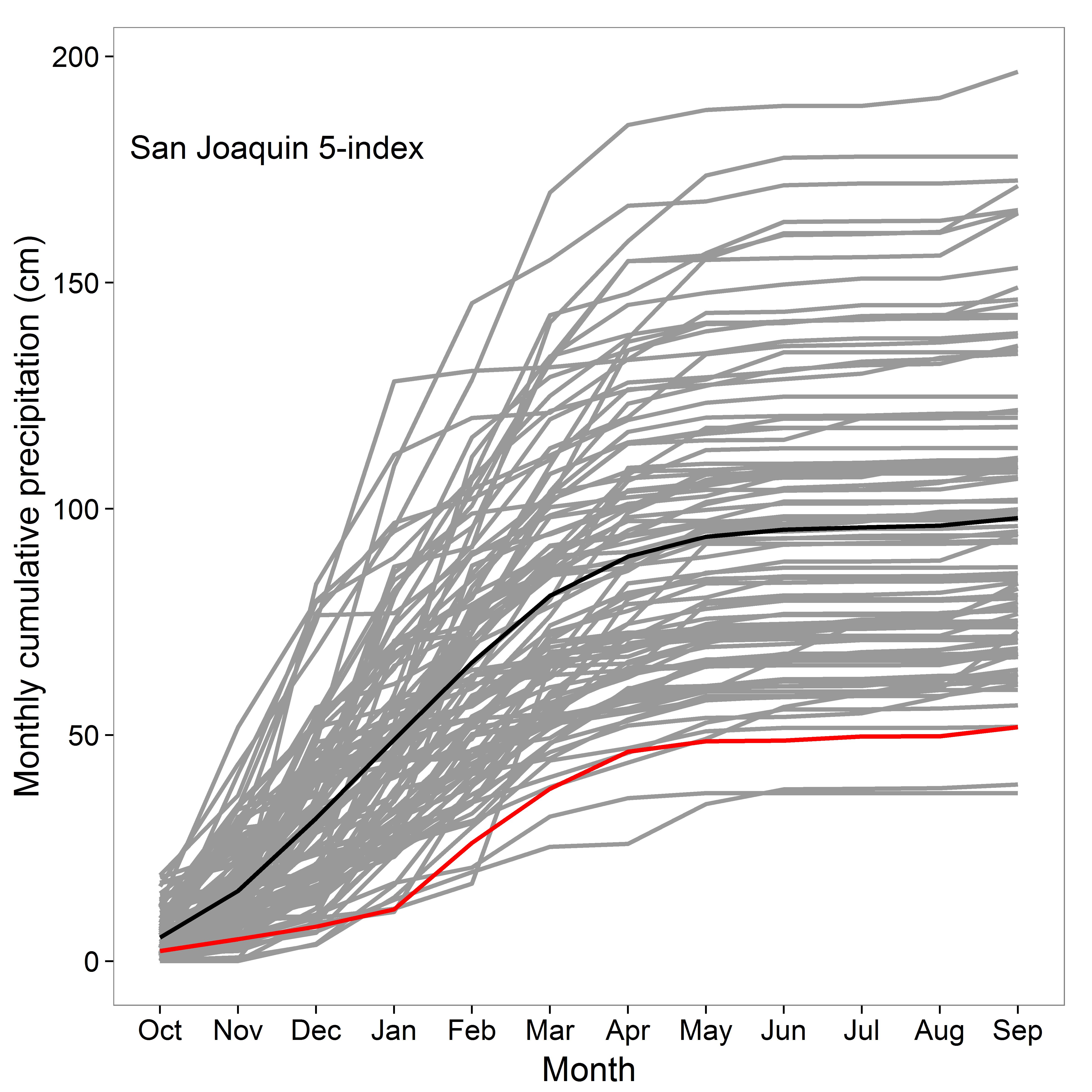 Wow! 2014 (red line) was super super dry compared to all other years (grey lines) and the average (black line).
How bad?
data.sj_total_ranked<-data.sj_total[order(-data.sj_total$precipitation),] #rank total precip, '-' reverses order to high then low
 which(data.sj_total_ranked$WY=="2014") #returns 100, which means that year 2014 was the 100th out of 102 for precipitation, yikes!
 tail(data.sj_total_ranked) #looking at the bottom, 1924 drought was the absolute worst
For this index which is 102 years long, 2014 was 100 out of 102! The 1924 drought was the worst. I heard San Francisco Bay looked like this…

That’s a crazy nice picture for 1924!
So obviously, the root of the drought crisis is a lack of rain.
<drops mic, walks offstage>
