
Complete separation occurs when data is perfectly discriminated by a predictor. Let me illustrate (literally, haha).

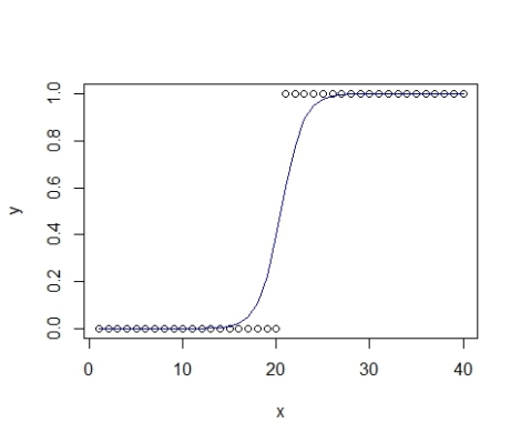
You’ll notice that the y-axis is binary, there are only 0s and 1s. That’s so meta if you think about it…
See in the lower graph how there are only zeroes until a specific point on X when they all turn into ones? That’s completely separated data, also called ‘monotone likelihood’ (ever wonder why scientists have trouble speaking with normal folks?). Complete separation is common with binomial data. And because I fancy binomial data, I guess I’m being punished (or rewarded?) with separation. Hence this post.
The problem of complete separation may be new to some folks, but it actually rears its ugly head fairly often. I’ve already experienced it in two places, first with predation data (e.g. predators ATE EVERYTHING; see figure) and again with physiological data (e.g. everything died at 32 degrees C!). We gave it a pretty hefty explanation in our recent paper. Separation causes issues by producing parameter estimates that diverge to + infinity (this is bad).

The fuzzy sarlacc pit. This voracious predator is ready to consume all of its prey, producing completely separated data that foils scientists trying to unlock its secrets.
But for those of you that have separated data, or those procrastinating on writing dissertation chapters, you’ve come to the right place!! Here’s some background reading and you should check out Heinze and Schemper 2002 for the solution that the ‘brglm’ package uses. Complete separation occurs often enough in medicine and other sciences that this paper has just under 800 citations. In brief, the solution reduces the bias of maximum likelihood estimates and produces robust standard errors.
Enough jabbering, let’s first try modeling separated data with the good ol’ glm function and watch in amusement as R freaks out.
First, let’s load packages, create the data, plot it, then turn it into a dataframe.
library(brglm);library(tidyr);library(ggplot2)
x<-seq(1,40,by=1)
y<-c(rep(0,20),rep(1,20))
plot(y~x)
data<-data.frame(x,y)
 Ok, now model this using ‘glm’.
m0<-glm(data=data, y~x, family="binomial")
summary(m0)
Warning messages:
1: glm.fit: algorithm did not converge
2: glm.fit: fitted probabilities numerically 0 or 1 occurred
It’s always fun to see warning messages! But we’ve still created a model and you can take a gander at the output (just the coefficients here).
Coefficients:
             Estimate Std. Error z value Pr(>|z|)
(Intercept)   -776.03  226643.12  -0.003    0.997
x               37.86   11052.47   0.003    0.997
While we don’t have parameter estimates converging on infinity, notice that those standard errors are huge! This is no good. Now let’s try the bias reduced method.
m1<-brglm(y~x, family=binomial, data=data)
summary(m1)
Coefficients:
            Estimate Std. Error z value Pr(>|z|)
(Intercept) -17.1592     8.7035  -1.972   0.0487 *
x             0.8370     0.4222   1.983   0.0474 *
Ahhh, those estimates and standard errors are looking much better now!
Now let’s create model estimates so we can plot them on our graph. Step one, extract the model coefficients.
b0=coef(m1)[1]
b1=coef(m1)[2]
Second, let’s create the predictions. There’s the long way and the short way. I’ll show you both.
p=(exp(b0+b1*x))/(1+exp(b0+b1*x)) #long way
p2=plogis(b0+b1*x)                #short way
plot(p~p2)                        #these are the same values, nifty
See, they’re the same method!
 Now let’s plot raw data and model estimates.
plot(y~x)                         #plot raw data
lines(x,p,col="blue")             #overlay model estimate, pretty!
Excellent! But this is a pretty simple scenario to model. What if we had two groups? Good question!
w<-c(rep(0,20),rep(1,20))         #create a group
z<-c(rep(0,32),rep(1,8))          #create another group
data2<-data.frame(x,w,z)          #this is wide format, we need it to be in long, use 'str' if this doesn't make sense
data3<-gather(data2, group,y, w:z)#conversion to long format
str(data3)                        #take a peek, long format baby!
Ok, so here, I’ve created two groups to model. Both exhibit complete separation. Don’t believe me?
ggplot(data3,aes(x=x,y=y,color=group))+geom_point(position=position_jitter(height=0.05))+theme_bw()
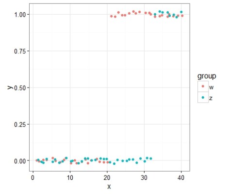
I hope you appreciated that sneaky switch to ggplot2 (I was too lazy to look up the solution using base R). Now let’s model it again!
m2<-brglm(y~x+group, family=binomial, data=data3)
summary(m2)
Coefficients:
            Estimate Std. Error z value Pr(>|z|)
(Intercept) -28.2954    13.0144  -2.174   0.0297 *
x             1.3803     0.6323   2.183   0.0290 *
groupz      -16.5630     7.7667  -2.133   0.0330 *
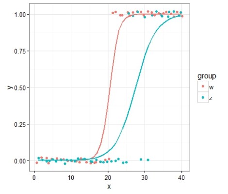
Now extract the model parameters.
c0=coef(m2)[1]                    #model intercept, group w
c1=coef(m2)[2]                    #model slope, same between groups
c2=coef(m2)[3]                    #model intercept, group z
Then create our estimates for each group.
p3=plogis(c0+c1*x)                #model estimate for group w
p4=plogis(c0+c2+c1*x)             #model estimate for group z
combinedp<-data.frame(x,p3,p4)    #create dataframe
Now plot again.
ggplot(data3,aes(x=x,y=value,color=group))+geom_point(position=position_jitter(height=0.05))+theme_bw()+
  geom_line(data=combinedp,aes(x=x,y=p3),color='#F8766D', size=1)+
  geom_line(data=combinedp,aes(x=x,y=p4),color='#00BFC4', size=1)

By the way, those color codes are the default for the two color scheme in ggplot2, thanks Stack Exchange!
You’ll notice that the slopes for those two groups are exactly the same (same logistic shape, just differing intercepts).
What if we wanted to allow the slopes to vary? First, let’s tweak the data so it makes sense for the slopes to vary.
data4<-data3 #clone the dataframes before you start tweaking values
data4[66,3]=1
data4[67,3]=1
data4[68,3]=1
data4[70,3]=1
data4[72,3]=1
So I just changed some of the data values. Now let’s model the new data, notice that the model includes an interaction term, hence “x*group” below.
m4<-brglm(y~x*group, family=binomial, data=data4)
summary(m4)
Coefficients:
            Estimate Std. Error z value Pr(>|z|)
(Intercept) -17.1583     8.7028  -1.972   0.0487 *
x             0.8370     0.4222   1.983   0.0474 *
groupz        7.1041     9.3994   0.756   0.4498
x:groupz     -0.4712     0.4411  -1.068   0.2854
Little evidence for an interaction effect, but let’s take a look at those model predictions anyway.
d0=coef(m4)[1]                    #model intercept, group w
d1=coef(m4)[2]                    #model slope, group w
d2=coef(m4)[3]                    #model intercept, group z
d3=coef(m4)[4]                    #model slope, group z
p3b=plogis(d0+d1*x)               #model estimate for group w
p4b=plogis(d0+d2+(d1+d3)*x)       #model estimate for group z
combinedp2<-data.frame(x,p3b,p4b) #create new dataframe with model estimates
Notice when constructing those new model estimates that the intercepts and slopes from group z are added to group w. This is a very important detail and is easy to miss.
Now the piece de resistance.
ggplot(data4,aes(x=x,y=y,color=group))+geom_point(position=position_jitter(height=0.05))+theme_bw()+
  geom_line(data=combinedp2,aes(x=x,y=p3b),color='#F8766D', size=1)+
  geom_line(data=combinedp2,aes(x=x,y=p4b),color='#00BFC4', size=1)
Hey alright! The rate of change from one binary state to another might differ between two groups. Interesante!
You could also use the package ‘logistf’ but the ‘brglm’ package I’ve used here seems promising. Check out Heinze and Ploner 2004 that describes ‘logistf’. If you are of the Bayesian persuasion, there is a solution to complete separation using weakly informative priors (i.e. Cauchy distribution; Gelman et al 2008). Perhaps this will be the next post!
At some point, I’ll be hosting this script (and others) on Github.

This was incredibly useful! Thanks for explaining this so well. I’ve been putting off analysis of my separated data for way to long.
Glad this was helpful for you!
Thank you! This has really helped with my analyses.
Awesome! Glad you found it useful.