Oceanographers love two things. 1. Expensive equipment and 2. Matlab.
I get the first one. I mean, who wouldn’t want to play with titantium 4km pressure rated CTDs or autonomous underwater vehicles?
I’m not 100% on why they fancy Matlab. I suppose it’s been the de facto standard within the field for a long time, and legacy is a big deal. It does make for some great graphs but if you’re a poor grad student at an institution that doesn’t have a subscription, you gotta cough up some cash.
Enter R. Specifically the package ‘OCE’, which has some nice features for plotting and working up oceanographic data. It’s written by Dan Kelley and Clark Richards. I’ve been wanting to try it out and when Shoals Marine Lab needed to break in their brand new Seabird CTD, I jumped at the chance to get on the boat, get some data, and try the package out.

Deploying the Seabird CTD
University of New Hampshire’s Gulf Challenger picked up the Field Introductory Oceanography Lab class and Erik Zettler was kind enough to let me tag along.
After a bit of steaming, we were about 10 km east of Appledore Island in the Gulf of Maine. The first order of business was to drop some casts and get some data!
The package has some built in datasets. So let’s take a quick gander at those first.
library(oce);library(ocedata)
data(ctd) #load example data, creating 'ctd' as an object
plot(ctd,which=c(1,2,3,5),fill="lightgrey")
#make some demo plots
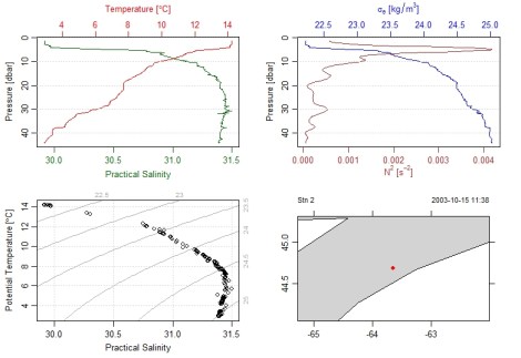
At top left and right we have some water column profiles and then a look at some temperature by salinity plots with contours of density. Nifty. The bottom right is a map. Looks like this built-in cast comes from 2003, going back in time!
Seabird has some GUI based software (Seasoft V2) to help massage the data. We processed a bit of data with that and created ‘.cnv’ files and then brought it into R.

CTD data processing by Shoaler Katy Bland as Erik Zettler looks on.
The function ‘read.ctd.sbe’ will import Seabird formatted cnv files. There are other read functions, for example, for the World Ocean Circulation Experiment and WHOI’s Ice-tethered profiler.
 #set your directory to the folder with your '.cnv' files
ctd1<-read.ctd.sbe(file="ctd1.cnv") #read.ctd.sbe makes some assumptions for seabird data
ctd3<-read.ctd.sbe(file="ctd3.cnv")
ctd5<-read.ctd.sbe(file="ctd5.cnv")
ctd7<-read.ctd.sbe(file="ctd7.cnv")
ctd9<-read.ctd.sbe(file="ctd9.cnv")
Unfortunately our CTD data doesn’t have gps data, so we have to bring it in manually.
ctd1@metadata$latitude  = 42.9873 #note the @ and $ identifiers
ctd1@metadata$longitude =-70.6056
ctd3@metadata$latitude  = 42.9732
ctd3@metadata$longitude =-70.5708
ctd5@metadata$latitude  = 42.9579
ctd5@metadata$longitude =-70.5343
ctd7@metadata$latitude  = 42.9425
ctd7@metadata$longitude =-70.5003
ctd9@metadata$latitude  = 42.9255
ctd9@metadata$longitude =-70.4632
Taking a look at a temperature profile closely, we can see that there is data from the downcast and the upcast.
plot(ctd7, which='temperature')

Usually, we would remove the upcast, as this column of water has been disturbed from the initial downcast. So let’s do that here.
ctd1.d<-ctdTrim(x=ctd1, method="downcast") #trim data to remove upcast
ctd3.d<-ctdTrim(x=ctd3, method="downcast")
ctd5.d<-ctdTrim(x=ctd5, method="downcast")
ctd7.d<-ctdTrim(x=ctd7, method="downcast")
ctd9.d<-ctdTrim(x=ctd9, method="downcast")
And we can check our result.
plot(ctd7.d, which='temperature')
 Now we can try stitching together multiple casts, into what is called a ‘section’. Then we’ll make a basic contour plot.
section1<-as.section(list(ctd1.d,ctd3.d,ctd5.d,ctd7.d,ctd9.d))
plot(section1,which='temperature', xtype='distance')
 So, ‘as.section’ creates a new ‘section’, using the list of objectives given.
Plot the temperature results of section, with distance on the x-axis. The distance
axis only works if you have the lat/longs given.
Alternatively, we could use colors instead of contour lines.
plot(section1,which='temperature', xtype='distance', ztype='image')

Cool! We can also plot other data types, if your instrument is equipped.
plot(section1,which='fluorescence', xtype='distance', ztype='image')
 Fluorescence comes from the fluorometer, which measures the quantity of primary producers in the water column. It’s pretty neat that you can see mid-water peaks of phytoplankton at the thermocline (where the there is a rapid temperature change). This probably reflects the zone of mixing between deeper nutrient rich waters and shallower brighter waters (but nutrient poor). But don’t take my word for it, I only moonlight as a biological oceanographer!
For now, we’ll leave it there, but the ‘oce’ package has a bunch of functionality (e.g. acoustic doppler profiler, echosounder, landsat) and apparently a book coming out soon. Thanks again to Dan Kelley and Clark Richards for writing this useful package! Side note: if you’re interested in collecting CTD data on a budget, check out the OpenCTD project!
